" height="24.05243258989812px" id="HhB4UN5Ev" width="56.657568182366504px"/></svg>)
Brand
Identity
Brand
Identity
Role & Responsibility
Role & Responsibility
DESIGNER & IllUSTRATOR
DESIGNER & IllUSTRATOR
Brand design, illustration, web design, packaging
Brand design, illustration, web design, packaging
RESPONSIBLE SON
RESPONSIBLE SON
"What else would you do with your art degree?"
"What else would you do with your art degree?"
Collaborators
Collaborators
My dad & sister
My dad & sister
Smilegreens is a small, family-owned microgreens farm founded by my dad. He takes great pride in the quality and flavor of his greens, supplying them to local high-end restaurants and markets. Naturally, my sister and I became involved in the business; my sister focusing on logistics and client relations, while I took on everything related to visual design and branding.
As for the name, it ultimately came down to a practical (and slightly humorous) reality: finding a combination of words we loved that also had an available web domain.
Smilegreens is a small, family-owned microgreens farm founded by my dad. He takes great pride in the quality and flavor of his greens, supplying them to local high-end restaurants and markets. Naturally, my sister and I became involved in the business; my sister focusing on logistics and client relations, while I took on everything related to visual design and branding.
As for the name, it ultimately came down to a practical (and slightly humorous) reality: finding a combination of words we loved that also had an available web domain.
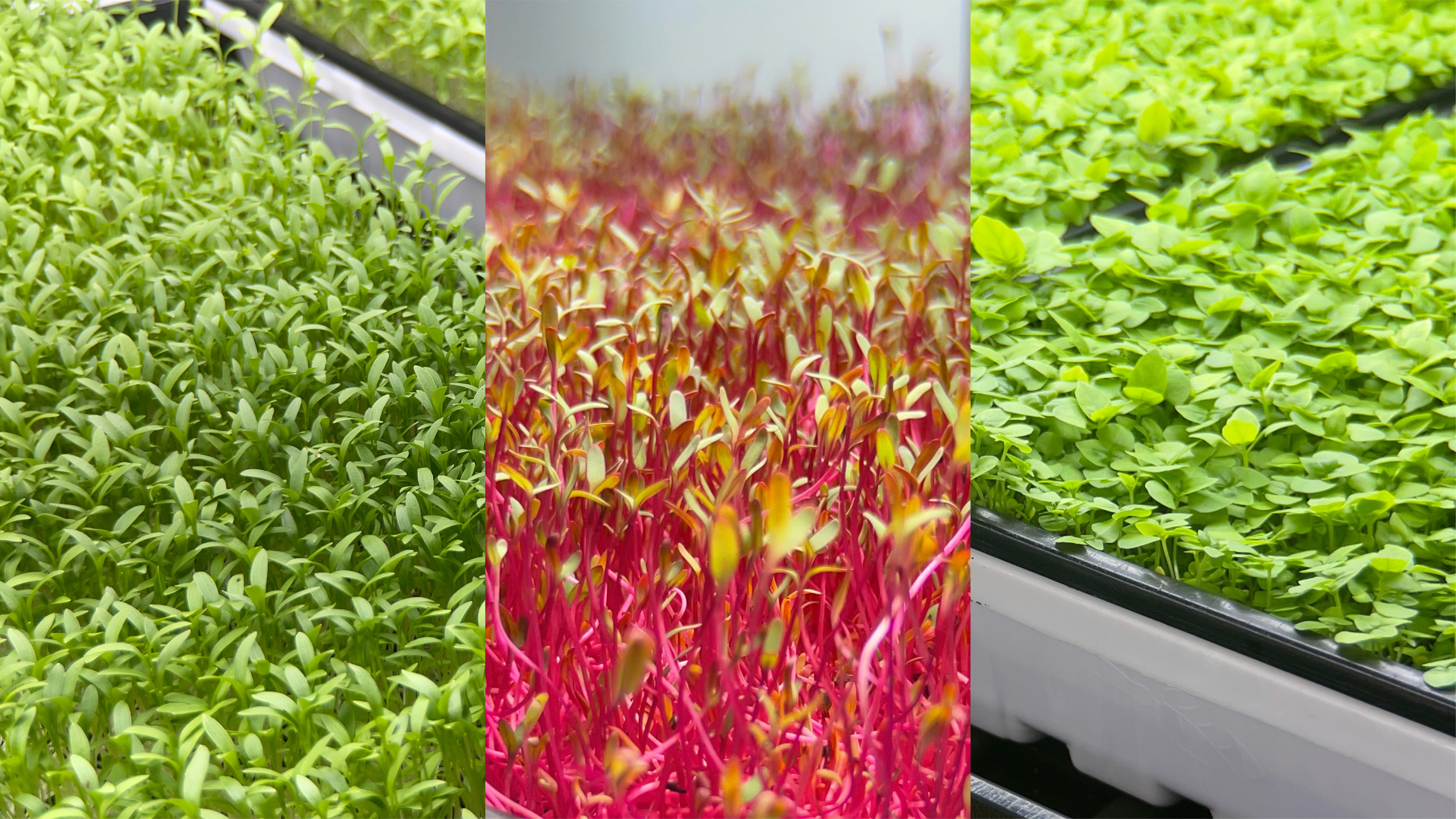
Our tasty, healthy microgreens!
Our tasty, healthy microgreens!
Approach & Execution
Approach & Execution
Given our roots as a neighborhood farm, I wanted the brand to reflect a sense of warmth and approachability. At the same time, it was important that Smilegreens feel contemporary and confident—not scrappy or low-budget. Working within limited resources, I modified the Sofia Pro typeface to create a custom logotype. Its clean, modern structure appealed to me, and by adding subtle rounded terminals, I was able to introduce a softer, more playful character.
Given our roots as a neighborhood farm, I wanted the brand to reflect a sense of warmth and approachability. At the same time, it was important that Smilegreens feel contemporary and confident—not scrappy or low-budget. Working within limited resources, I modified the Sofia Pro typeface to create a custom logotype. Its clean, modern structure appealed to me, and by adding subtle rounded terminals, I was able to introduce a softer, more playful character.

Logotype.
Logotype.
The symbol design was intentionally simple: a leafy green paired with a smile. I briefly considered adding eyes, but decided against it to preserve clarity and scalability—especially for smaller applications where minimalism is key.
The symbol design was intentionally simple: a leafy green paired with a smile. I briefly considered adding eyes, but decided against it to preserve clarity and scalability—especially for smaller applications where minimalism is key.

Vertical and horizontal lockup with the symbol. It's a green, with a smile.
Vertical and horizontal lockup with the symbol. It's a green, with a smile.
Professional photography wasn’t within budget—or my skill set—so I explored alternative ways to make the brand stand out among produce packaging at local markets and grocery stores. One thing I noticed was the absence of illustration, even among more premium brands like AeroFarms and Gotham Greens. I leaned into that gap, creating soft, textured illustrations designed to evoke a bit of charm—ideally sparking that small “aww” moment that nudges shoppers to add Smilegreens to their cart.
Professional photography wasn’t within budget—or my skill set—so I explored alternative ways to make the brand stand out among produce packaging at local markets and grocery stores. One thing I noticed was the absence of illustration, even among more premium brands like AeroFarms and Gotham Greens. I leaned into that gap, creating soft, textured illustrations designed to evoke a bit of charm—ideally sparking that small “aww” moment that nudges shoppers to add Smilegreens to their cart.
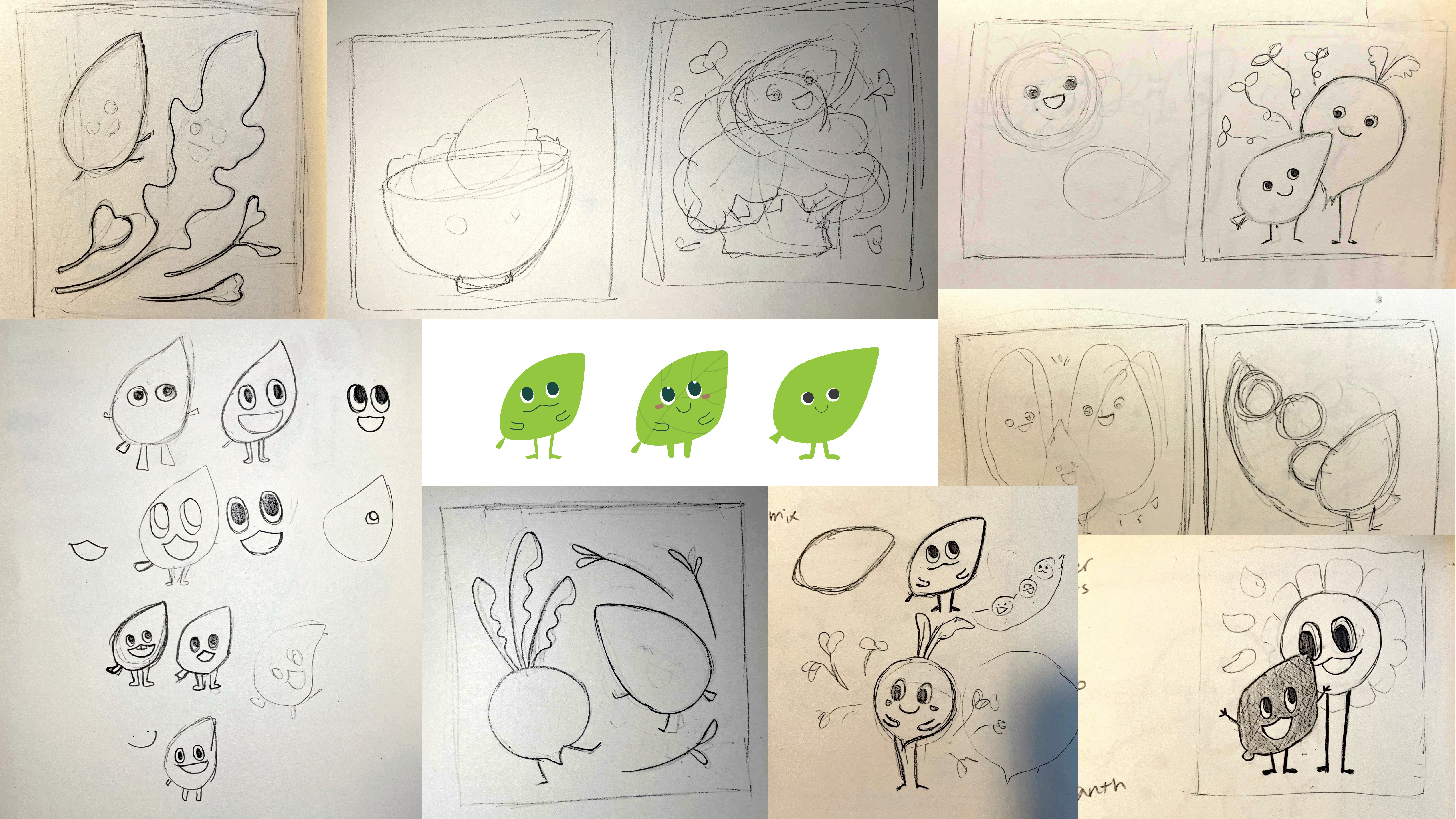
Early sketches of illustrations I've done to create the main character and various vegetables.
Early sketches of illustrations I've done to create the main character and various vegetables.
I’m not a professional illustrator, so the process was both challenging and refreshingly outside my usual workflow.
The characters remain officially unnamed, though I’ve always referred to the main leafy figure as “Ippy,” inspired by the Korean word for leaf (잎, pronounced “ip”).
I’m also fairly certain my dad has no idea that name exists.
I’m not a professional illustrator, so the process was both challenging and refreshingly outside my usual workflow.
The characters remain officially unnamed, though I’ve always referred to the main leafy figure as “Ippy,” inspired by the Korean word for leaf (잎, pronounced “ip”).
I’m also fairly certain my dad has no idea that name exists.
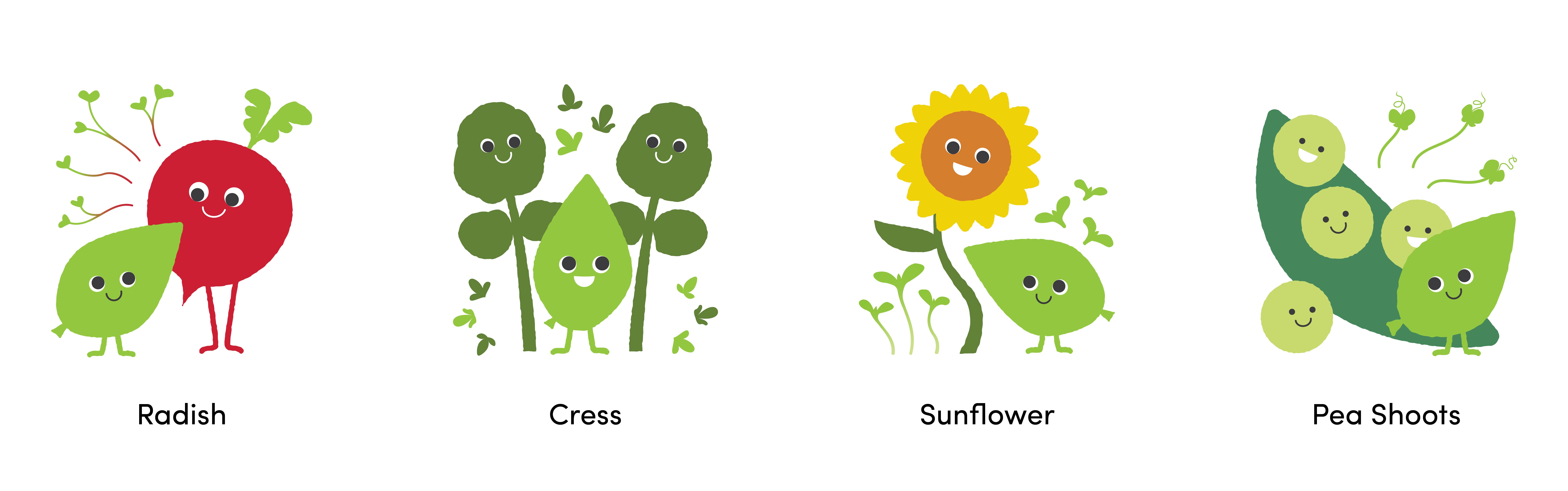
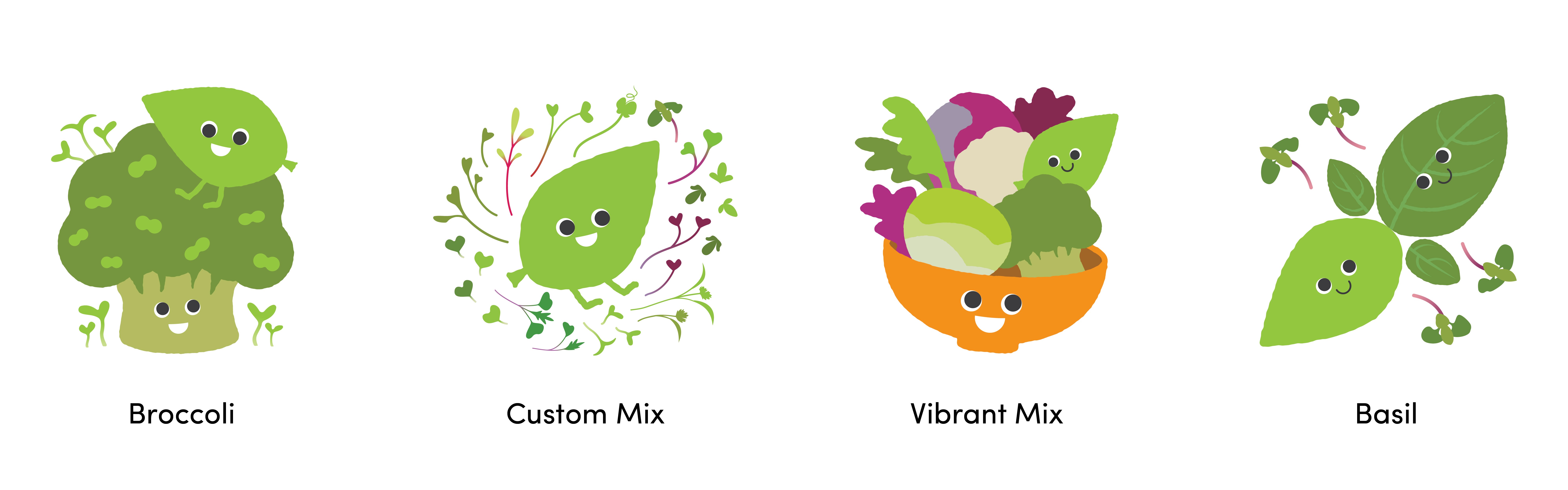
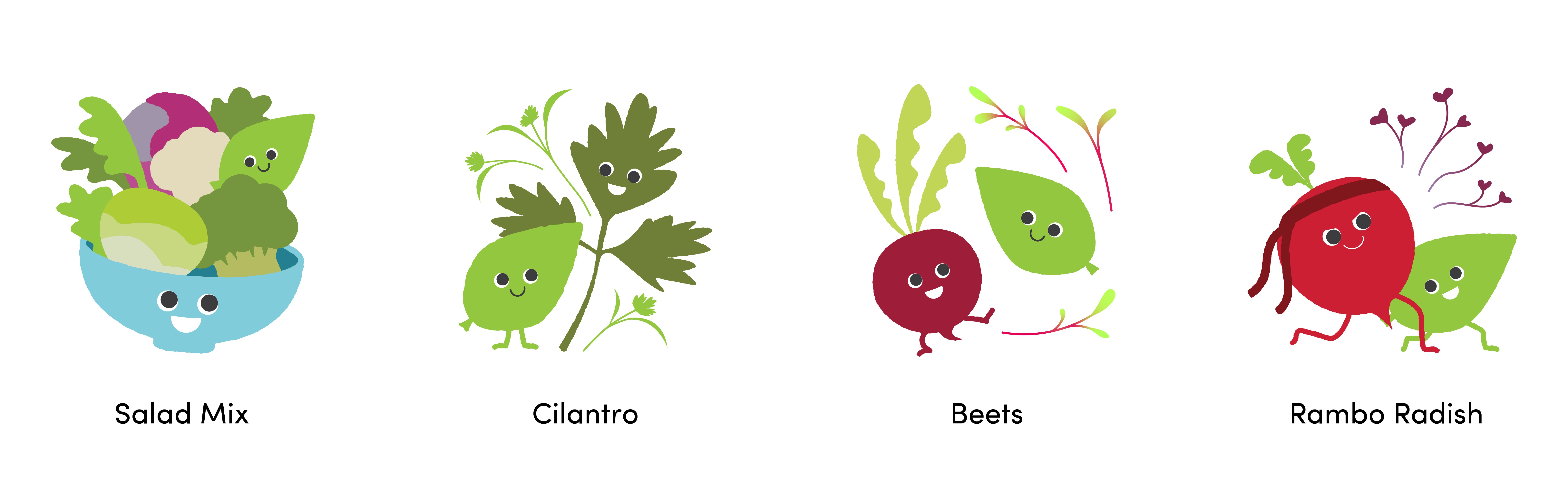
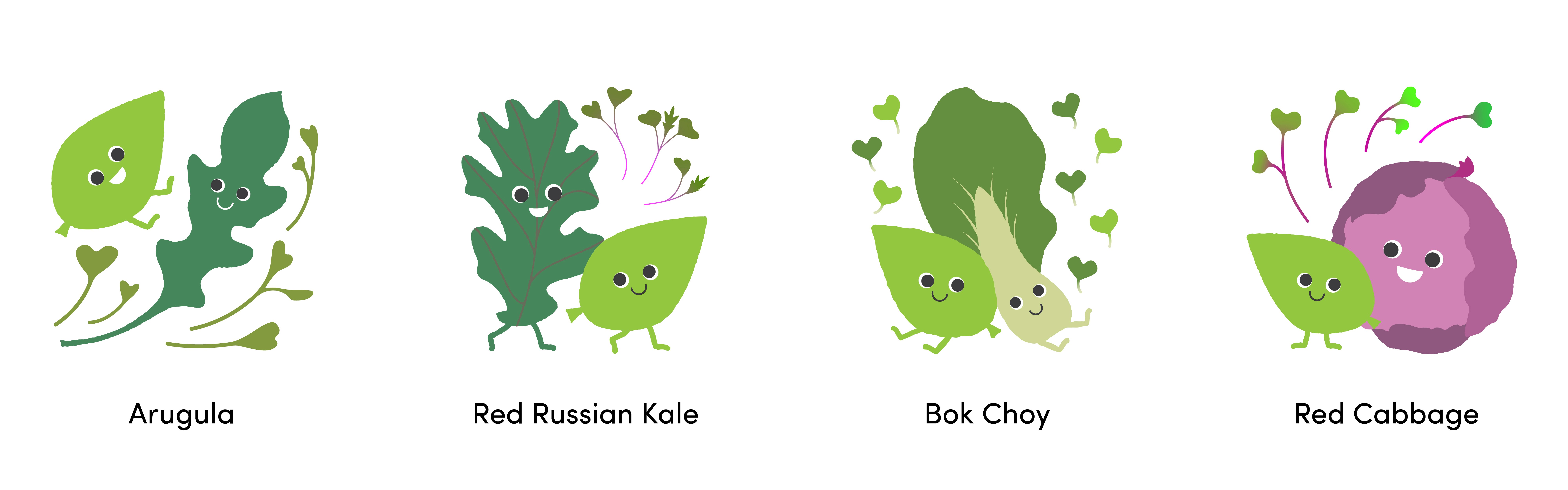
Final sketches of Ippy and its vegetable pals.
The packaging itself is intentionally simple—a peelable sticker applied to a plastic container. Anything more elaborate would have significantly increased production costs. With limited space and various regulatory requirements, the design has evolved over time as the business has grown and taken on new clients.
The packaging itself is intentionally simple—a peelable sticker applied to a plastic container. Anything more elaborate would have significantly increased production costs. With limited space and various regulatory requirements, the design has evolved over time as the business has grown and taken on new clients.
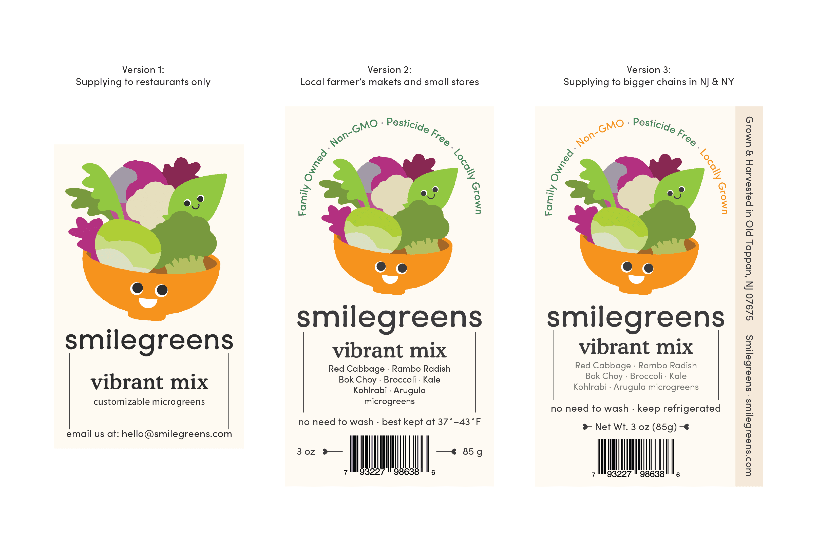
Packaging design evolution as the business expanded.
Packaging design evolution as the business expanded.
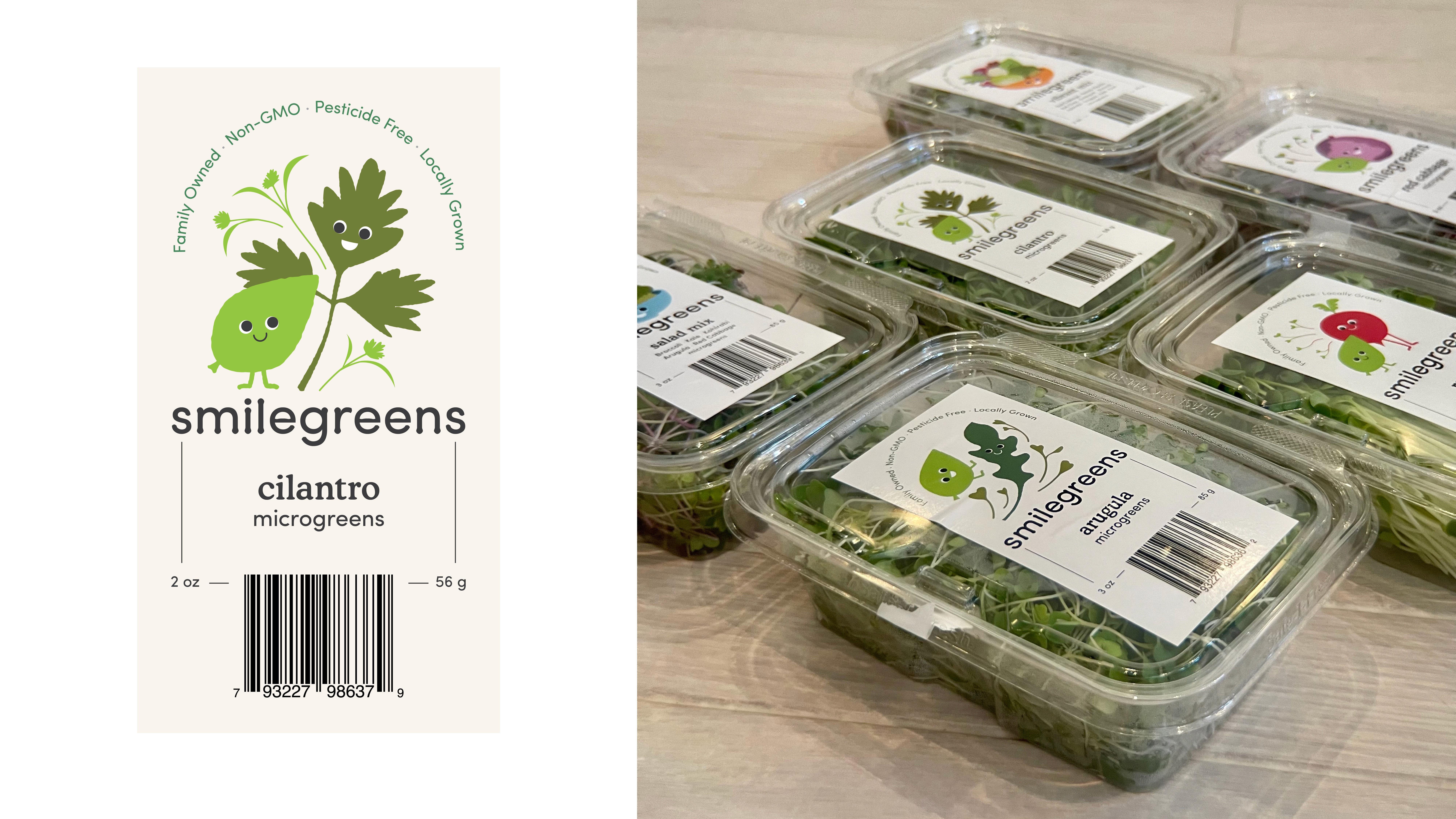
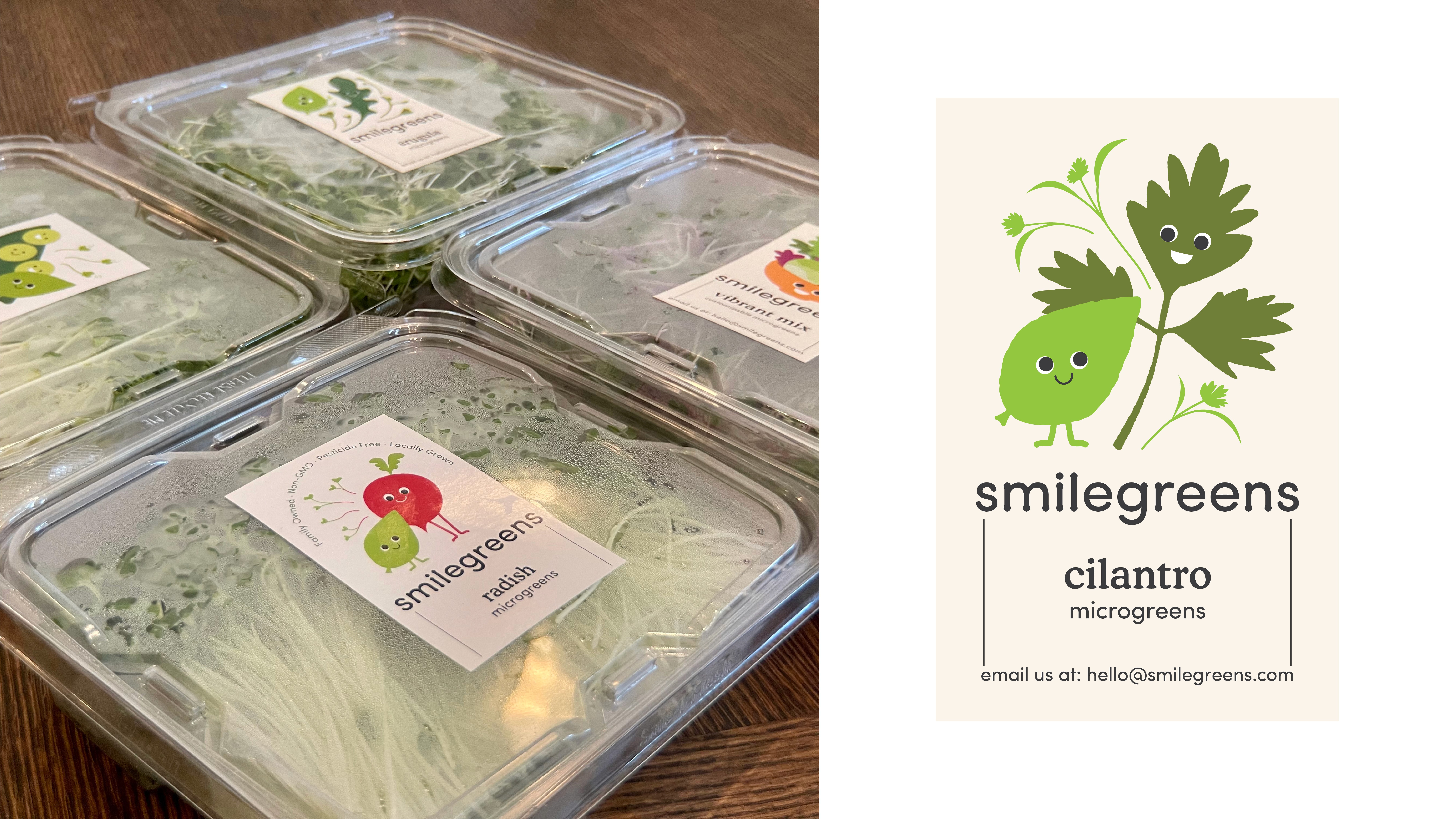
Packaging design in real life. There are many like it, but this one is mine.
Packaging design in real life. There are many like it, but this one is mine.
As a side project, I created a poster mockup featuring some of the high-end local restaurants we supply—partly for fun, and partly as a potential marketing asset.
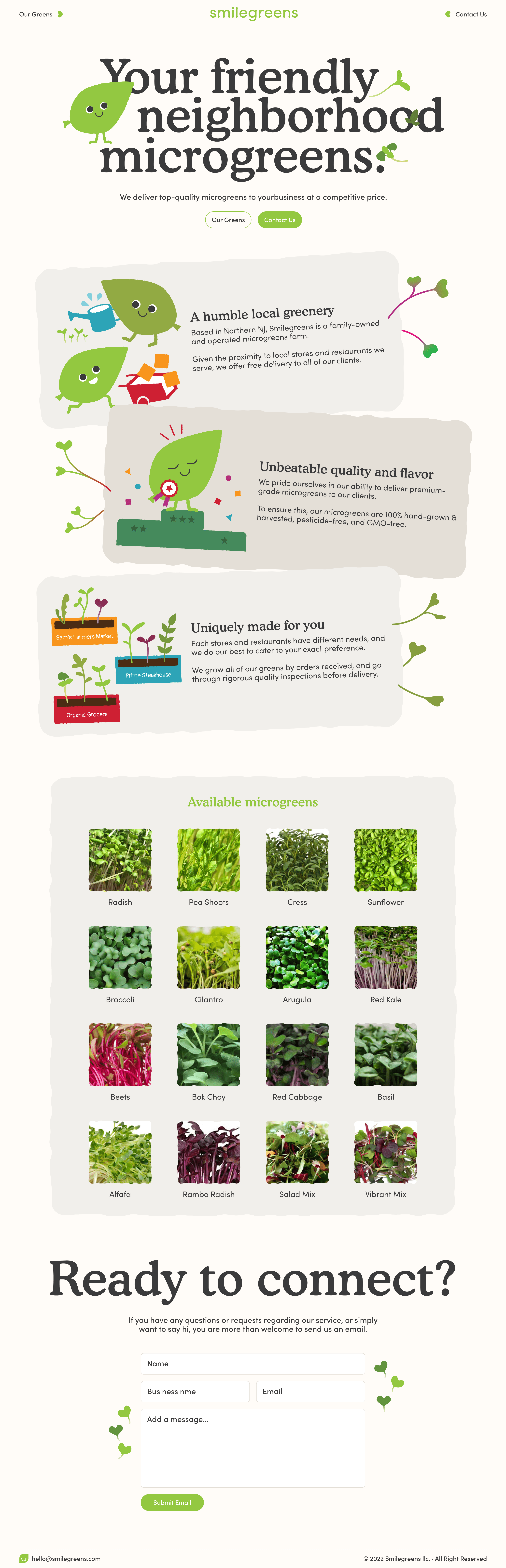
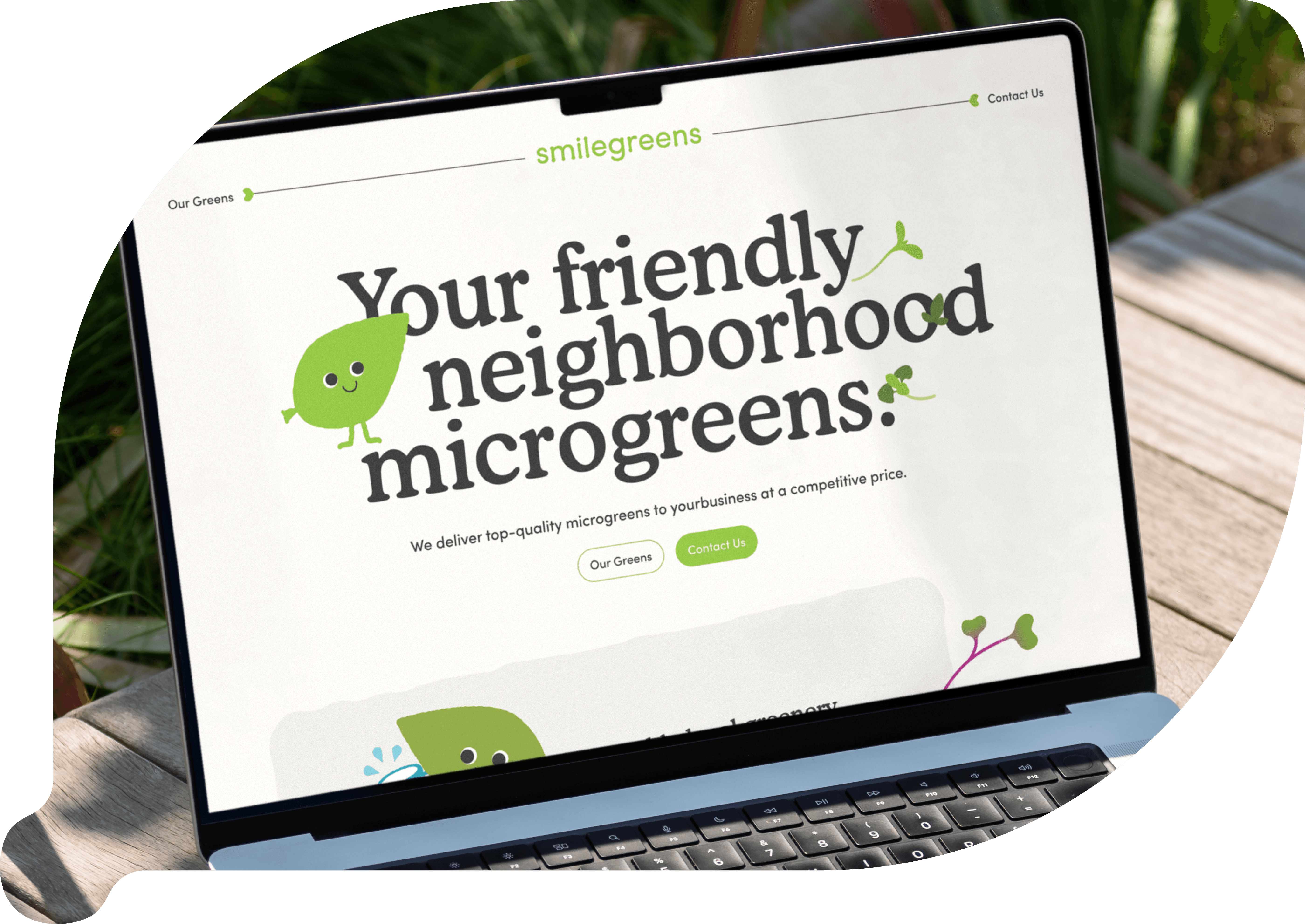
More importantly, I developed a one-page website, with plans to expand it into a full marketing site. The goal is to eventually include professional photography of the indoor farm and, ideally, a photo of my dad carefully tending each batch of microgreens with a level of care that might almost make his son jealous.
Almost.
As a side project, I created a poster mockup featuring some of the high-end local restaurants we supply—partly for fun, and partly as a potential marketing asset.
More importantly, I developed a one-page website, with plans to expand it into a full marketing site. The goal is to eventually include professional photography of the indoor farm and, ideally, a photo of my dad carefully tending each batch of microgreens with a level of care that might almost make his son jealous.
Almost.
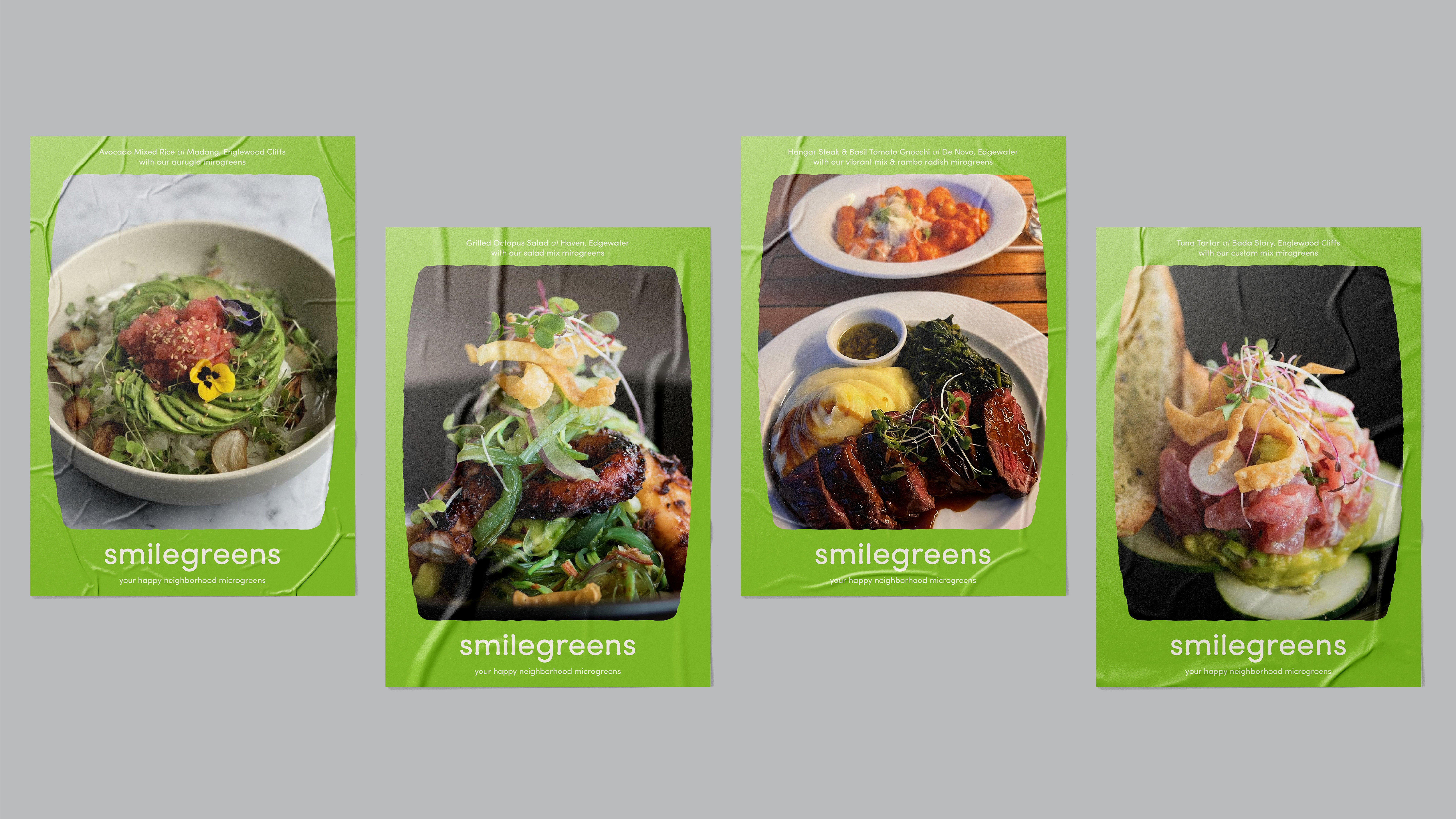
Some poster mockups I played around with.
Some poster mockups I played around with.