" height="24.05243258989812px" id="HhB4UN5Ev" width="56.657568182366504px"/></svg>)
Engagement
Features
Engagement
Features
Role & Responsibility
Role & Responsibility
PRODUCT DESIGN
PRODUCT DESIGN
Design, product & branding ownership, hands-on contribution
Design, product & branding ownership, hands-on contribution
PRODUCT RESEARCH
PRODUCT RESEARCH
E2E research ownership
E2E research ownership
PRODUCT STRATEGY
PRODUCT STRATEGY
Strategy roadmap & stakeholder alignment
Strategy roadmap & stakeholder alignment
Collaborators
Collaborators
Co-founder · Engineering · Sales Associate
Co-founder · Engineering · Sales Associate
I co-founded a South Korean food marketplace and led design, product, and branding while working remotely from the US. After I rebuilt the product's engagement features and led a pivot in the business model, the app saw a huge boost in conversions and user content contribution.
These improvements, together with the business model shift, helped build early brand loyalty and contributed to securing additional vendors and strategic partnerships.
I co-founded a South Korean food marketplace and led design, product, and branding while working remotely from the US. After I rebuilt the product's engagement features and led a pivot in the business model, the app saw a huge boost in conversions and user content contribution.
These improvements, together with the business model shift, helped build early brand loyalty and contributed to securing additional vendors and strategic partnerships.
Outcome
Outcome
53%
53%
Increase in
user interactions
Increase in user interactions
4x
4x
Increase in
conversions
Increase in conversions
3x
3x
Increase in
user content
Increase in user content
The situation
The situation
South Korea's Home Meal Replacement market had grown into a $4B category with 32% year-over-year growth, driven by busier lifestyles and a rise in single-person households. As brands flooded the market, shoppers were left with too many options and no trusted way to find products that matched their taste. QPQ was a B2B2C marketplace and social platform I co-founded to close that gap.
I led design, product, and branding from the US while the rest of the team was in South Korea, which meant setting up clear async processes for collaboration and decision-making from the start.
South Korea's Home Meal Replacement market had grown into a $4B category with 32% year-over-year growth, driven by busier lifestyles and a rise in single-person households. As brands flooded the market, shoppers were left with too many options and no trusted way to find products that matched their taste. QPQ was a B2B2C marketplace and social platform I co-founded to close that gap.
I led design, product, and branding from the US while the rest of the team was in South Korea, which meant setting up clear async processes for collaboration and decision-making from the start.
The problem
The problem
After the MVP launch, QPQ struggled to gain traction. Conversion was low and users rarely created content, which directly hurt the health of the marketplace. The original product detail page showed user-generated content below the product photos and description, and the team assumed a credit-based incentive would drive participation. It did not.
Rather than keep tuning the incentive, I argued the problem ran deeper, in usability and value alignment, and pushed for a full investigation into user behavior and strategy before the numbers slipped further.
After the MVP launch, QPQ struggled to gain traction. Conversion was low and users rarely created content, which directly hurt the health of the marketplace. The original product detail page showed user-generated content below the product photos and description, and the team assumed a credit-based incentive would drive participation. It did not.
Rather than keep tuning the incentive, I argued the problem ran deeper, in usability and value alignment, and pushed for a full investigation into user behavior and strategy before the numbers slipped further.
Initial PDP flow.
Initial PDP flow.
Research across a continent
Research across a continent
Because I was in the US while the product and audience were in South Korea, I built a remote research strategy: I mentored the team to run interviews locally while I handled competitive analysis with the founder. Alongside that, I ran what I called "field notes," an informal ethnographic study of real dining conversations to capture how people actually talk about sharing and recommending food.
I synthesized the notes and led a team brainstorm to pull out design opportunities, translating the five strongest behavioral patterns into early feature concepts:
Comparing the same dish across different brands or restaurants.
Comparing a dish with another that shares a similar flavor.
Recommending a food and drink pairing.
Recommending flavor enhancements.
Recommending another dish that fits the current mood.
Because I was in the US while the product and audience were in South Korea, I built a remote research strategy: I mentored the team to run interviews locally while I handled competitive analysis with the founder. Alongside that, I ran what I called "field notes," an informal ethnographic study of real dining conversations to capture how people actually talk about sharing and recommending food.
I synthesized the notes and led a team brainstorm to pull out design opportunities, translating the five strongest behavioral patterns into early feature concepts:
Comparing the same dish across different brands or restaurants.
Comparing a dish with another that shares a similar flavor.
Recommending a food and drink pairing.
Recommending flavor enhancements.
Recommending another dish that fits the current mood.
Exploration
Exploration
I sketched each idea by hand, mapping flows and interface elements. Designing across cultures was a real challenge, since Korean UX expectations differ from Western patterns, so I ran frequent feedback sessions with the local team to stay aligned on user expectations and cultural nuance. After weighing feedback and feasibility, I narrowed to three concepts: VS Comparison, Still Not Sure?, and Pairing Recommendation. While building the wireframes I worked with the founder and sales associate on copywriting, which was critical to the tone of these features, and ran another round of user testing before moving to high fidelity.
I sketched each idea by hand, mapping flows and interface elements. Designing across cultures was a real challenge, since Korean UX expectations differ from Western patterns, so I ran frequent feedback sessions with the local team to stay aligned on user expectations and cultural nuance. After weighing feedback and feasibility, I narrowed to three concepts: VS Comparison, Still Not Sure?, and Pairing Recommendation. While building the wireframes I worked with the founder and sales associate on copywriting, which was critical to the tone of these features, and ran another round of user testing before moving to high fidelity.
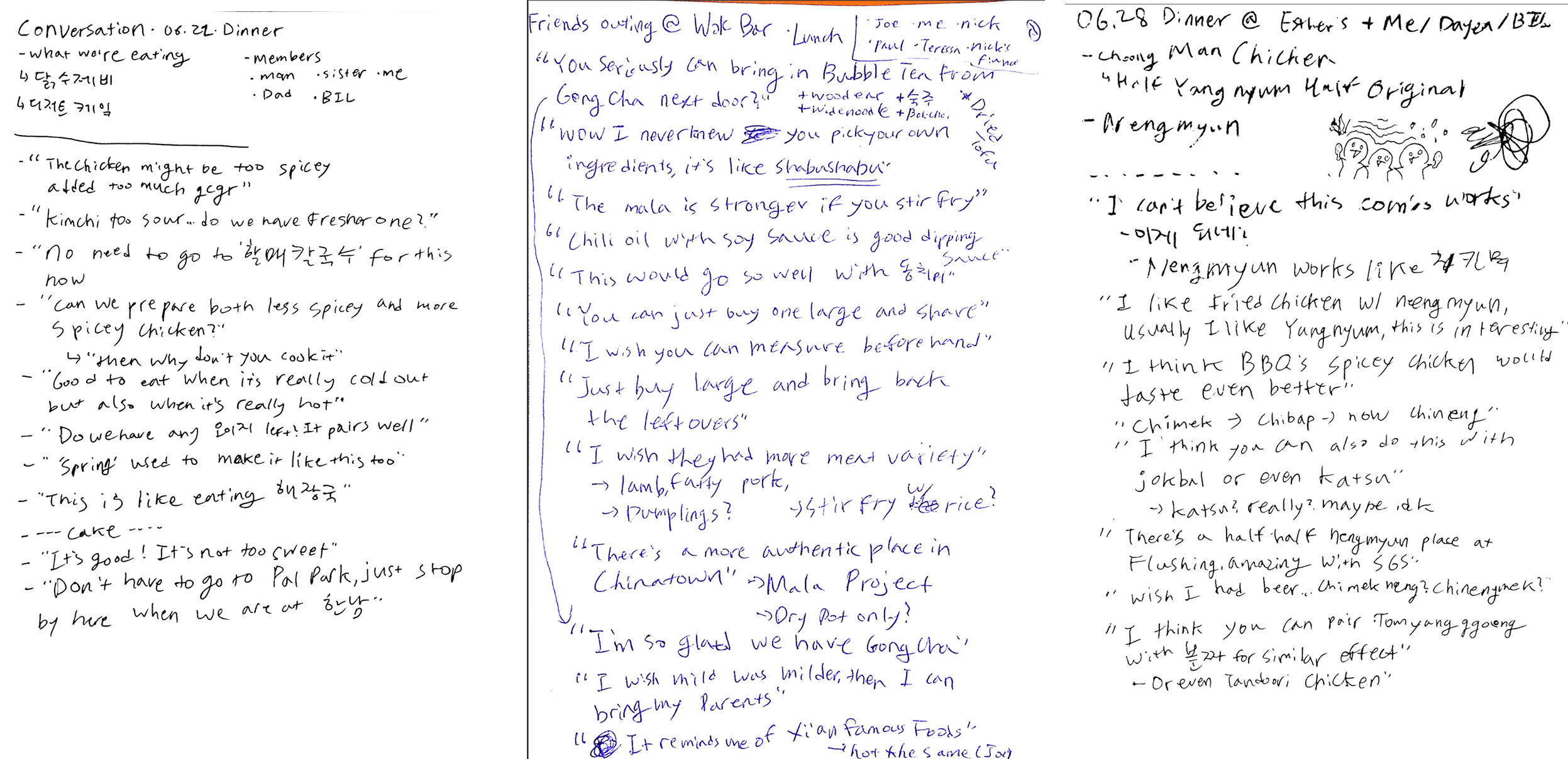
Some example pages of “Field notes” taken by me. Legible handwriting was not a priority, which I later came to regret when I decided to put them in my portfolio.
Some example pages of “Field notes” taken by me. Legible handwriting was not a priority, which I later came to regret when I decided to put them in my portfolio.
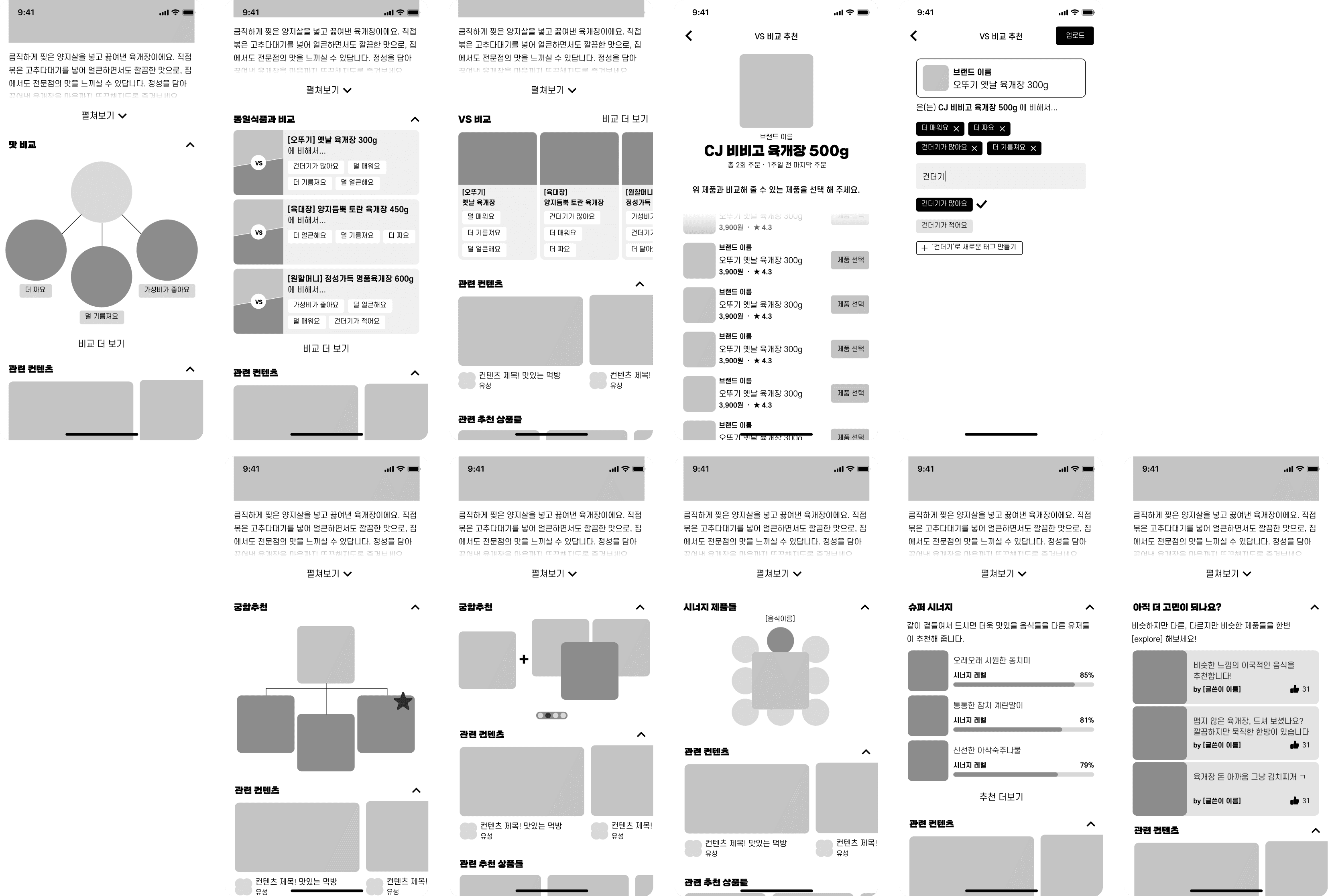
Low fidelity wireframes.
Low fidelity wireframes.
Final design
Final design
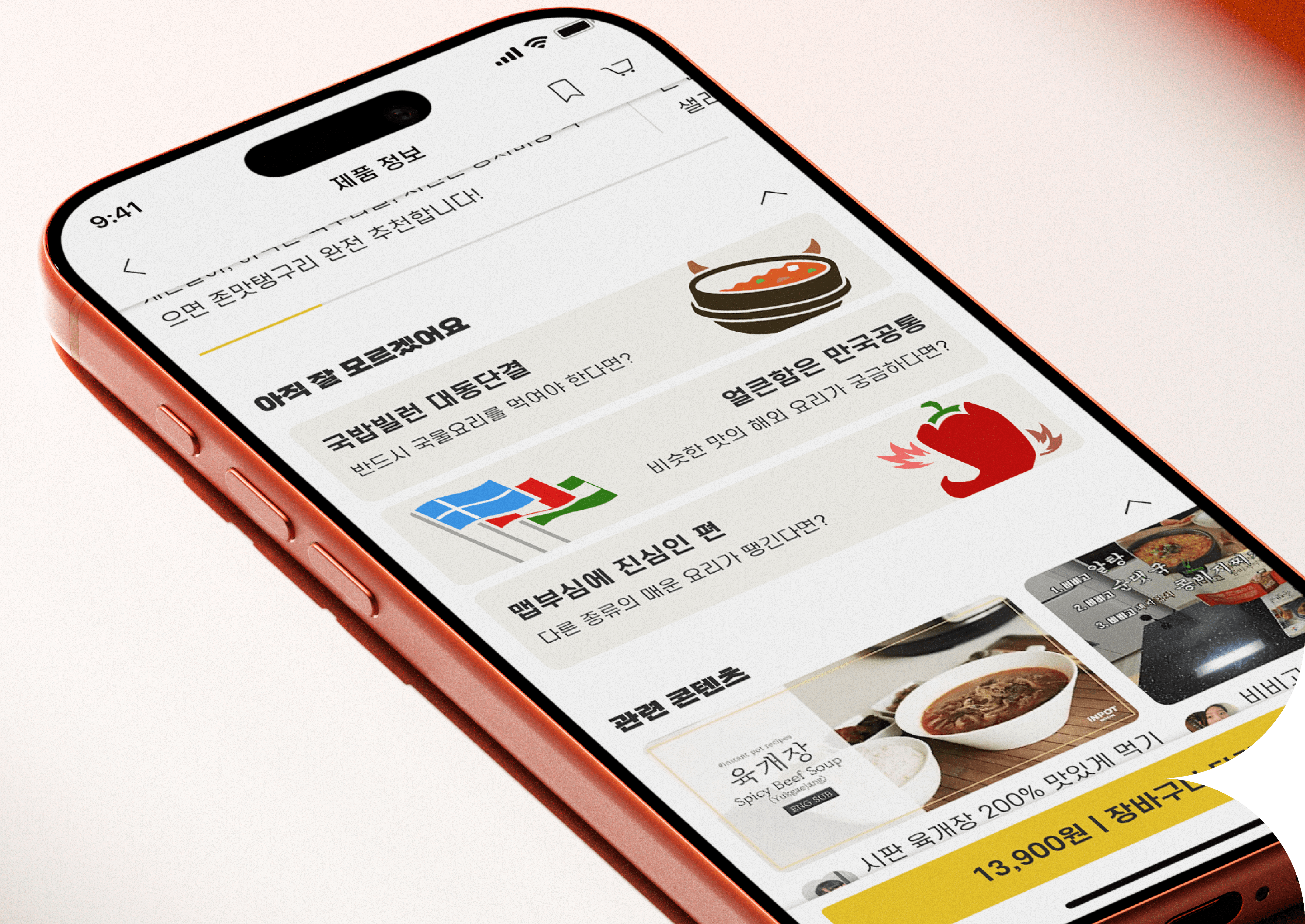
The refined product detail page introduced three new sections after the main product details: VS Comparison, Pairing Recommendation, and Still Not Sure? The original user-generated content stayed, since research participants still wanted it.
The refined product detail page introduced three new sections after the main product details: VS Comparison, Pairing Recommendation, and Still Not Sure? The original user-generated content stayed, since research participants still wanted it.
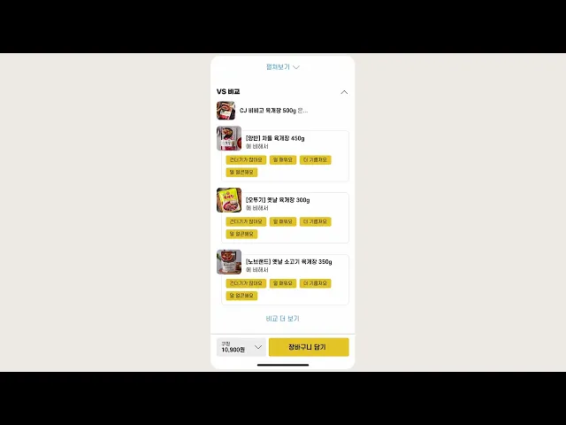
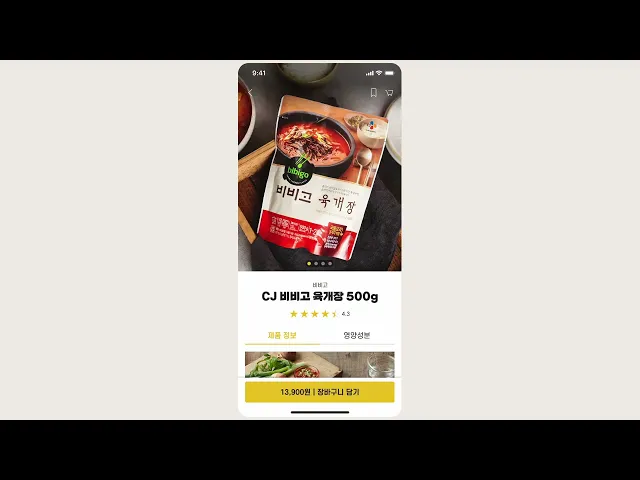
Updated PDP prototype.
Updated PDP prototype.
VS Comparison
VS Comparison
VS Comparison lets users tag specific product attributes and compare them against alternatives, for example one brand's spicy beef soup being richer but milder than another's. This peer-driven comparison helps people choose with confidence. I ran several iterations, refining labeling and interaction through testing.
VS Comparison lets users tag specific product attributes and compare them against alternatives, for example one brand's spicy beef soup being richer but milder than another's. This peer-driven comparison helps people choose with confidence. I ran several iterations, refining labeling and interaction through testing.
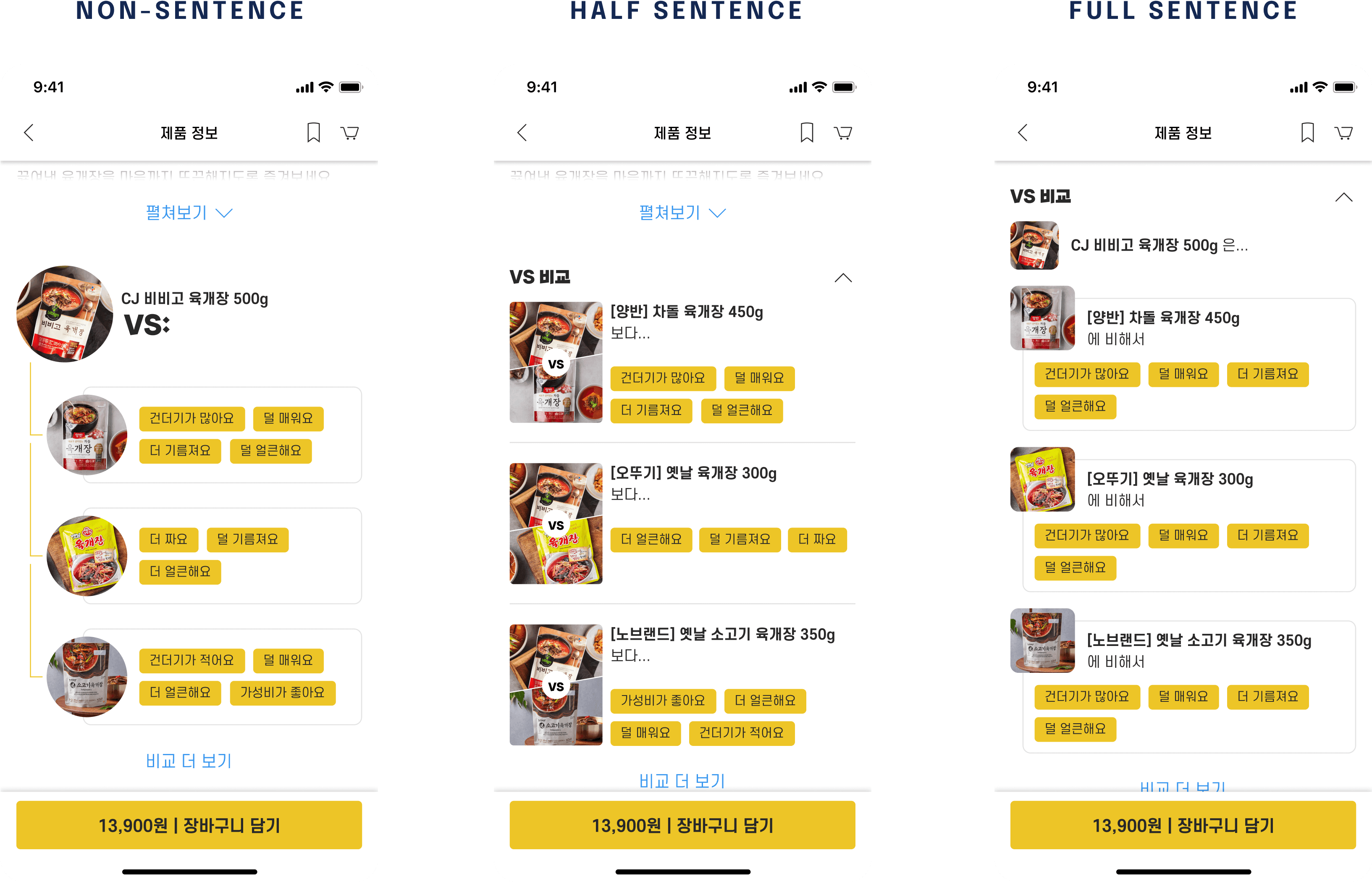
VS Comparison iterations.
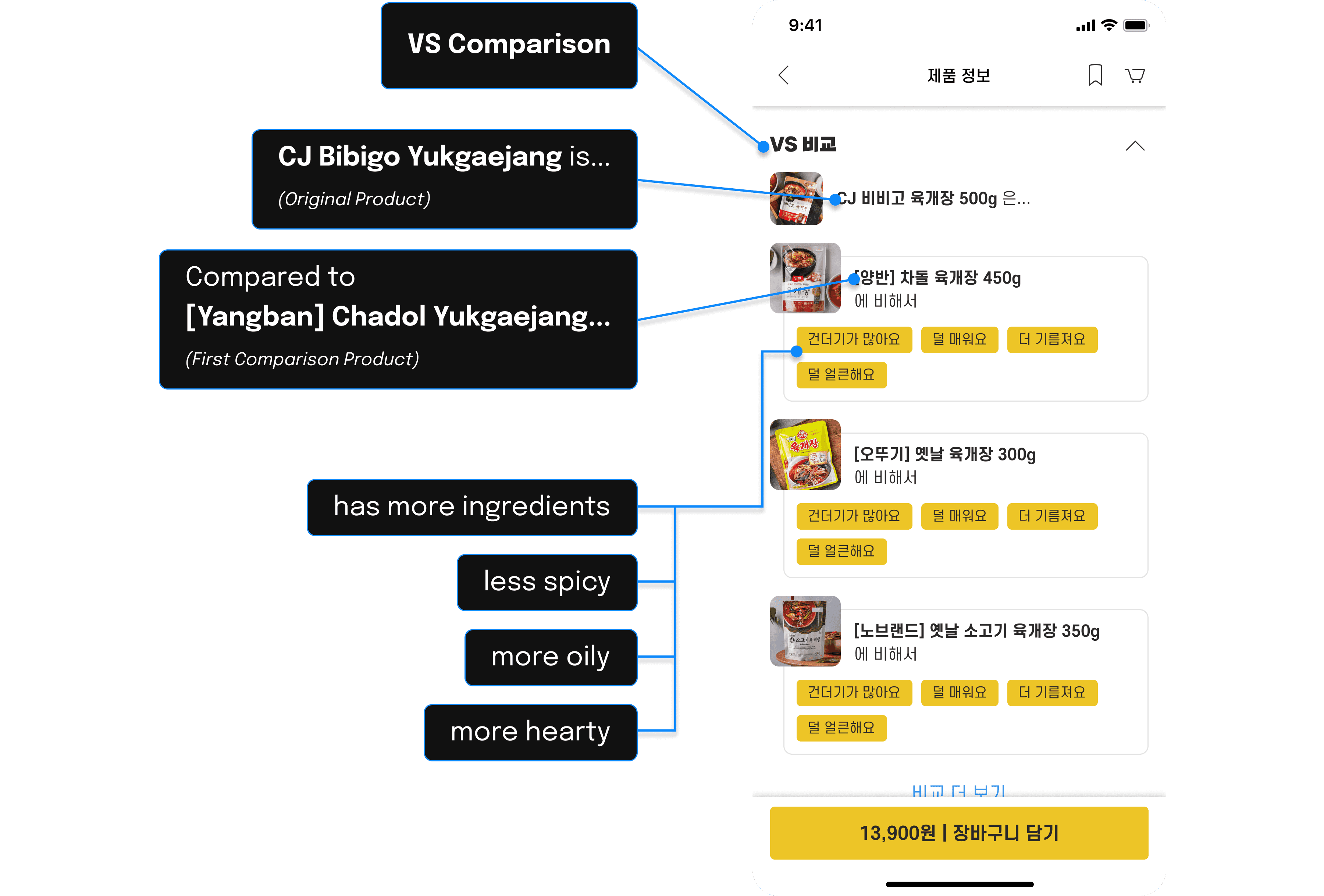
VS Comparison translations.
VS Comparison translations.
Pairing Recommendation
Pairing Recommendation
Pairing Recommendation grew out of how central food pairing is to Korean dining, letting users recommend complementary dishes. Early prototypes looked like a diagram, which users read as branching navigation rather than pairings, so I simplified it with a "+" icon to make the intent clear. Feedback showed users wanted to add descriptions and recipe notes, which I built into the final design. Early prototypes resembled a diagram, which users found confusing—it looked like branching navigation rather than pairings. Simplifying the interface with a “+” icon made the intent clearer, and feedback revealed users wanted to add descriptions or recipe notes, which were integrated into the final design.
Pairing Recommendation grew out of how central food pairing is to Korean dining, letting users recommend complementary dishes. Early prototypes looked like a diagram, which users read as branching navigation rather than pairings, so I simplified it with a "+" icon to make the intent clear. Feedback showed users wanted to add descriptions and recipe notes, which I built into the final design. Early prototypes resembled a diagram, which users found confusing—it looked like branching navigation rather than pairings. Simplifying the interface with a “+” icon made the intent clearer, and feedback revealed users wanted to add descriptions or recipe notes, which were integrated into the final design.
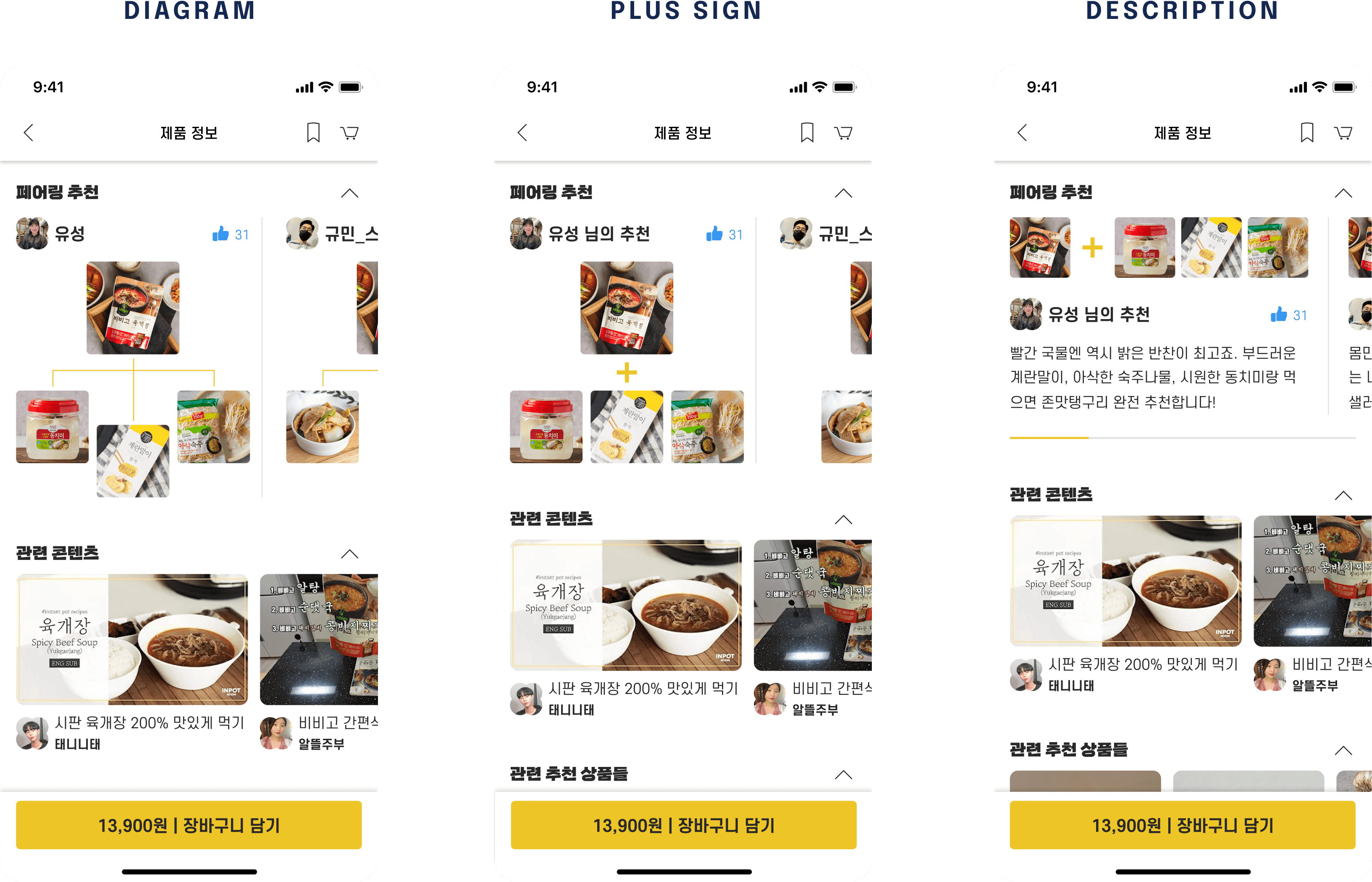
Pairing recommendation iterations.
Pairing recommendation iterations.
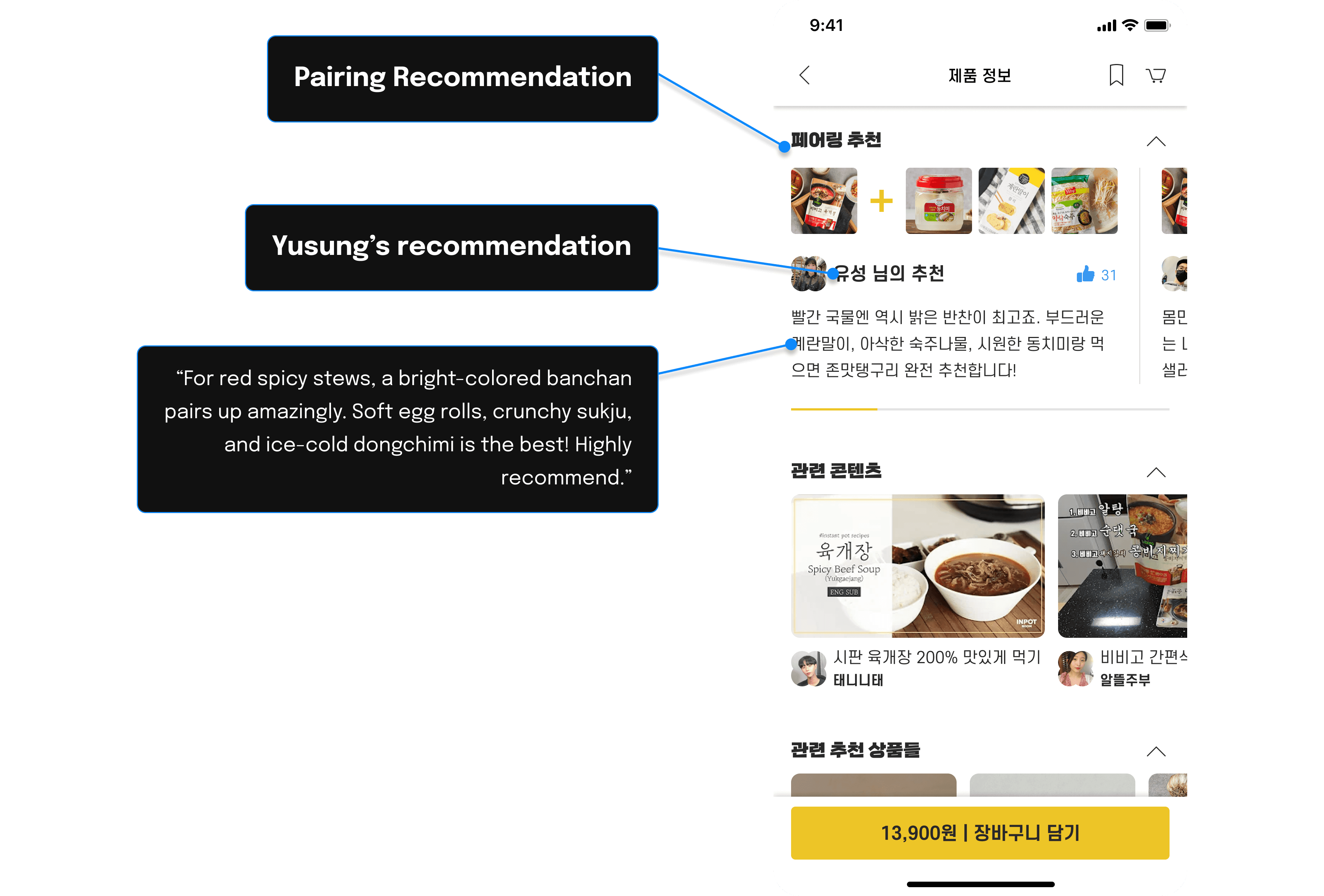
Pairing recommendation translations.
Pairing recommendation translations.
Still Not Sure?
Still Not Sure?
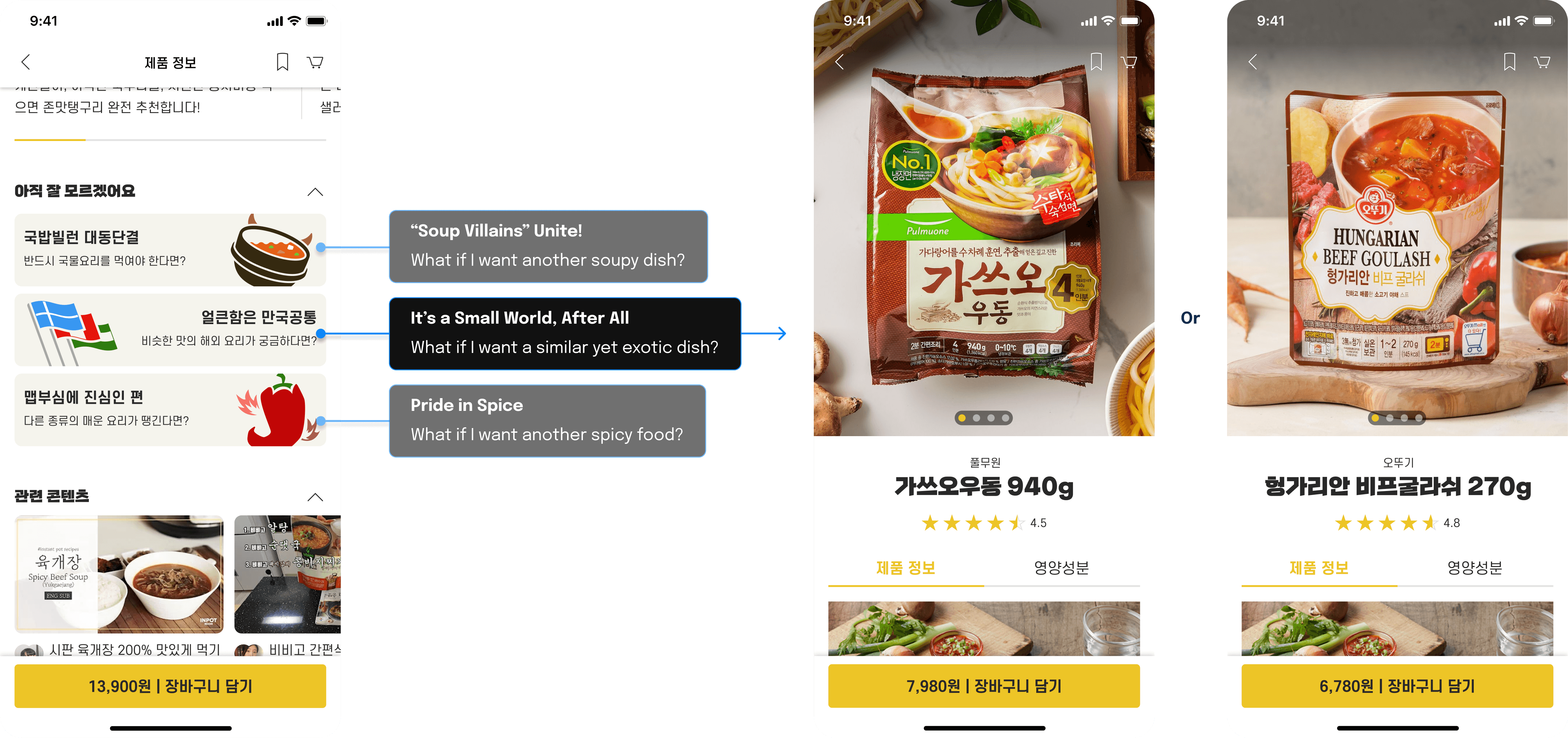
Still Not Sure? took inspiration from the now-defunct whatthehellshouldiwatchonnetflix.com and its context-based recommendations, adapted to food discovery with prompts that suggest alternatives based on intent or preference. Early versions stumbled because users were unsure how to generate meaningful content, so I switched to curated prompts backed by illustrations and witty copy, which improved both engagement and enjoyment.
Still Not Sure? took inspiration from the now-defunct whatthehellshouldiwatchonnetflix.com and its context-based recommendations, adapted to food discovery with prompts that suggest alternatives based on intent or preference. Early versions stumbled because users were unsure how to generate meaningful content, so I switched to curated prompts backed by illustrations and witty copy, which improved both engagement and enjoyment.
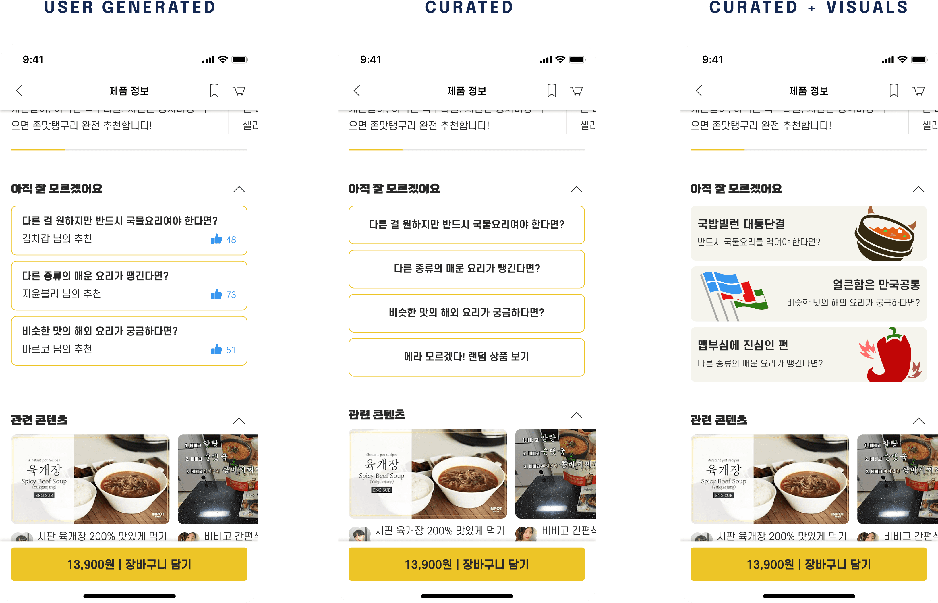
Still not sure? iterations.
Still not sure? iterations.