" height="24.05243258989812px" id="HhB4UN5Ev" width="56.657568182366504px"/></svg>)

" height="24.82px" id="YYC4lm3GV" width="26.486000000000004px"/><path d="M 0.001 23.037 L 0.001 0.547 L 2.475 0.547 L 2.475 14.565 L 14.105 0.547 L 17.35 0.547 L 5.14 14.919 C 5.14 14.919 9.847 20.338 17.615 20.589 L 17.606 23.039 C 6.495 22.074 2.473 15.595 2.473 15.595 L 2.473 23.038 L 0 23.038 Z M 26.654 23.295 C 25.154 23.295 23.79 22.925 22.558 22.186 C 21.34 21.461 20.333 20.431 19.635 19.198 C 18.917 17.945 18.558 16.536 18.558 14.973 C 18.558 13.41 18.917 12.007 19.635 10.765 C 20.337 9.539 21.344 8.515 22.558 7.793 C 23.79 7.053 25.165 6.684 26.686 6.684 C 27.628 6.684 28.539 6.84 29.417 7.15 C 30.294 7.46 31.11 7.922 31.827 8.515 L 31.827 6.941 L 34.205 6.941 L 34.205 23.039 L 31.86 23.039 L 31.86 21.336 C 30.447 22.643 28.711 23.296 26.655 23.296 Z M 26.879 21.206 C 27.848 21.214 28.807 21.011 29.69 20.612 C 30.525 20.241 31.258 19.674 31.826 18.958 L 31.826 10.99 C 31.269 10.305 30.556 9.765 29.69 9.368 C 28.807 8.968 27.848 8.766 26.879 8.774 C 25.765 8.774 24.752 9.042 23.843 9.577 C 22.941 10.104 22.197 10.864 21.69 11.777 C 21.165 12.71 20.903 13.765 20.903 14.942 C 20.903 16.12 21.165 17.181 21.69 18.123 C 22.198 19.049 22.941 19.824 23.843 20.373 C 24.753 20.93 25.765 21.208 26.879 21.208 Z M 37.889 23.037 L 37.889 0.547 L 40.266 0 L 40.266 8.642 C 41.637 7.337 43.361 6.682 45.439 6.682 C 46.959 6.682 48.331 7.052 49.552 7.792 C 50.759 8.517 51.76 9.54 52.459 10.763 C 53.177 12.005 53.535 13.409 53.535 14.971 C 53.535 16.534 53.177 17.943 52.459 19.196 C 51.764 20.426 50.762 21.456 49.552 22.185 C 48.331 22.924 46.949 23.293 45.407 23.293 C 44.471 23.294 43.541 23.131 42.661 22.812 C 41.779 22.495 40.958 22.027 40.235 21.43 L 40.235 23.036 L 37.89 23.036 L 37.89 23.037 Z M 45.215 21.206 C 46.349 21.206 47.367 20.933 48.267 20.386 C 49.161 19.846 49.897 19.083 50.404 18.17 C 50.928 17.238 51.192 16.184 51.192 15.006 C 51.192 13.827 50.93 12.768 50.404 11.825 C 49.901 10.905 49.164 10.135 48.267 9.592 C 47.367 9.045 46.349 8.772 45.215 8.772 C 44.246 8.764 43.286 8.967 42.403 9.366 C 41.568 9.738 40.835 10.305 40.266 11.021 L 40.266 18.988 C 40.823 19.674 41.54 20.215 42.419 20.611 C 43.297 21.007 44.25 21.21 45.213 21.205 L 45.215 21.205 Z M 63.589 23.359 C 62.068 23.359 60.682 22.989 59.428 22.249 C 58.191 21.526 57.166 20.49 56.456 19.246 C 55.727 17.983 55.363 16.569 55.363 15.005 C 55.363 13.44 55.727 12.028 56.456 10.763 C 57.166 9.518 58.191 8.483 59.428 7.76 C 60.68 7.02 62.067 6.65 63.588 6.65 C 65.111 6.65 66.523 7.02 67.765 7.76 C 68.995 8.487 70.013 9.522 70.72 10.763 C 71.449 12.028 71.813 13.441 71.813 15.005 C 71.813 16.568 71.448 17.983 70.72 19.246 C 70.014 20.488 68.995 21.524 67.765 22.25 C 66.523 22.99 65.131 23.359 63.589 23.359 Z M 63.589 21.238 C 64.639 21.249 65.67 20.96 66.561 20.403 C 67.449 19.847 68.179 19.072 68.681 18.153 C 69.205 17.212 69.469 16.162 69.469 15.005 C 69.469 13.848 69.207 12.772 68.681 11.84 C 68.175 10.928 67.445 10.16 66.561 9.608 C 65.671 9.05 64.681 8.773 63.589 8.773 C 62.496 8.773 61.506 9.051 60.617 9.608 C 59.732 10.16 59.002 10.928 58.496 11.84 C 57.97 12.772 57.708 13.828 57.708 15.005 C 57.708 16.182 57.97 17.212 58.496 18.154 C 58.998 19.073 59.728 19.848 60.616 20.404 C 61.506 20.96 62.496 21.238 63.589 21.238 Z M 81.867 23.359 C 80.346 23.359 78.96 22.989 77.706 22.249 C 76.469 21.526 75.444 20.491 74.734 19.246 C 74.005 17.983 73.642 16.569 73.642 15.005 C 73.642 13.44 74.005 12.028 74.734 10.763 C 75.444 9.518 76.469 8.482 77.706 7.76 C 78.959 7.02 80.345 6.65 81.867 6.65 C 83.389 6.65 84.801 7.02 86.043 7.76 C 87.273 8.487 88.292 9.522 88.999 10.763 C 89.727 12.028 90.091 13.441 90.091 15.005 C 90.091 16.568 89.726 17.983 88.999 19.246 C 88.292 20.488 87.273 21.523 86.043 22.25 C 84.801 22.99 83.409 23.359 81.867 23.359 Z M 81.867 21.238 C 82.959 21.238 83.95 20.959 84.839 20.403 C 85.727 19.847 86.457 19.072 86.959 18.153 C 87.484 17.212 87.747 16.162 87.747 15.005 C 87.747 13.848 87.485 12.772 86.959 11.84 C 86.453 10.928 85.723 10.16 84.839 9.608 C 83.95 9.05 82.959 8.773 81.867 8.773 C 80.775 8.773 79.784 9.051 78.895 9.608 C 78.01 10.16 77.28 10.928 76.774 11.84 C 76.249 12.772 75.987 13.828 75.987 15.005 C 75.987 16.182 76.249 17.212 76.774 18.154 C 77.277 19.073 78.007 19.848 78.895 20.404 C 79.784 20.96 80.775 21.238 81.867 21.238 Z M 92.659 23.037 L 92.659 6.941 L 95.036 6.941 L 95.036 8.707 C 96.257 7.315 97.831 6.619 99.759 6.619 C 100.894 6.619 101.901 6.881 102.779 7.406 C 103.645 7.918 104.356 8.657 104.835 9.542 C 105.499 8.557 106.291 7.823 107.212 7.342 C 108.133 6.859 109.183 6.619 110.361 6.619 C 111.539 6.619 112.567 6.881 113.445 7.406 C 114.323 7.93 115.04 8.686 115.517 9.591 C 116.021 10.522 116.272 11.61 116.272 12.851 L 116.272 23.036 L 113.927 23.036 L 113.927 13.334 C 113.927 11.899 113.552 10.769 112.803 9.944 C 112.053 9.119 111.035 8.706 109.751 8.706 C 108.902 8.698 108.067 8.926 107.341 9.366 C 106.612 9.804 105.991 10.463 105.477 11.341 C 105.52 11.577 105.558 11.818 105.59 12.063 C 105.622 12.31 105.638 12.572 105.638 12.851 L 105.638 23.035 L 103.293 23.035 L 103.293 13.332 C 103.293 11.898 102.918 10.768 102.169 9.942 C 101.419 9.118 100.412 8.705 99.149 8.705 C 98.291 8.705 97.516 8.903 96.819 9.299 C 96.122 9.696 95.528 10.279 95.036 11.05 L 95.036 23.034 L 92.659 23.034 Z" fill="rgb(0, 0, 0)" height="23.359px" id="BeNvhF5L6" transform="translate(35.5 1.5)" width="116.27200000000005px"/></g></svg>)
Core
Experience
Core
Experience
Role & Responsibility
Role & Responsibility
PRODUCT DESIGN
PRODUCT DESIGN
Product direction, hands-on contribution & team management
Product direction, hands-on contribution & team management
PRODUCT RESEARCH
PRODUCT RESEARCH
E2E research collaboration - planning, execution & insight reporting
E2E research collaboration - planning, execution & insight reporting
PRODUCT STRATEGY
PRODUCT STRATEGY
Vision definition, strategy roadmap & stakeholder alignment
Vision definition, strategy roadmap & stakeholder alignment
Collaborators
Collaborators
Product Design (1 lead, 2 designers) · Product Lead · CEO · Engineering
Product Design (1 lead, 2 designers) · Product Lead · CEO · Engineering
Kaboom is an emerging B2B CRM SaaS focused on using AI to aggregate internal and external data across prospects, accounts, and contacts, then translate that data into clear next-step recommendations.
I joined as a part-time Head of Design two years after the company’s inception. I worked closely with leadership to shape product direction and guide design-led decision-making, while leading a small team of designers to bring the vision into execution.

Kaboom's interface, before I joined.
Kaboom's interface, before I joined.
Problem
Problem
Despite securing early clients, Kaboom lacked a clear product vision. Roadmap decisions were largely driven by client requests and founder intuition, which led to a fragmented experience with too many loosely connected features.
This resulted in low feature adoption and high abandonment. The product was costly to maintain and difficult for users to understand.
Kaboom needed a focused reset in both product strategy and experience design. I took ownership of guiding the team through this shift.
Research
Research
To better understand the problem space, I initiated a series of client interviews.
Users consistently valued Kaboom’s core meeting experience, including AI-assisted meeting prep, note-taking, summaries, and follow-ups. However, the rest of the product felt disconnected and lacked a cohesive workflow.
AI capabilities were also underutilized outside of meetings, which limited perceived value. In addition, users highlighted gaps in responsive design, noting that reliable access across devices was critical to their workflow.
I continued engaging clients throughout the process to ensure our direction stayed aligned with real needs.

Excerpt from client interview summary.
Excerpt from client interview summary.
Primary goals
Primary goals
Based on these insights, I worked with stakeholders to define a clearer set of transformation goals.:
1. Feature pruning & align focus
Streamline the feature set by removing underutilized functionalities and prioritizing the high-value tools that users rely on most.
2. Define value proposition
Define a clear core value proposition that anchors design decisions and communicates why the product is essential to users.
3. Foundation for future growth
Rethink the product from the ground up to create a scalable foundation for future features and integrations.
Strategy
Strategy
With alignment on the problems and goals, I facilitated a series of vision-setting workshops. Together, we defined Kaboom’s core value proposition and long-term direction.
We audited the full feature set and identified what was essential to the core experience. Non-core features were removed to reduce complexity and improve focus, especially given their low adoption. Some were set aside for future reconsideration.

Kaboom's feature sets transformation.
Kaboom's feature sets transformation.
I also introduced an architectural diagram to map how the new experience should function end to end. This served as a shared reference for product, design, and engineering, guiding both MVP decisions and future expansion.
Kaboom’s strength lies in aggregating complex data from multiple sources, structuring it into usable insights, and translating those insights into actionable recommendations. The new architecture was designed to reinforce that strength.

Architectural diagram for Kaboom's new core experience.
Architectural diagram for Kaboom's new core experience.
A key initiative was establishing a design system. Leadership was initially hesitant due to concerns about scope, and preferred to reuse existing UI.
I pushed for a systemized approach, highlighting how existing inconsistencies would compound as the product scaled. Without clear standards, usability and development efficiency would continue to degrade.
We aligned on starting with a lean system focused on essential components, with room to evolve over time. As part of this effort, I refreshed typography and color to create a more cohesive and flexible visual foundation.

New design system examples, highlighting typography and colors.
New design system examples, highlighting typography and colors.
Design brainstorming
Design brainstorming
During wireframing, the primary challenge was defining what information mattered most, especially on the dashboard.
This required balancing UX fundamentals like hierarchy and clarity with product thinking around what insights, alerts, and actions would drive value.
In parallel, I pushed the team to think beyond surface-level AI features and integrate AI more meaningfully across the experience. This led to introducing a generative AI chatbot as a central interaction layer that connects across workflows.
I also explored updates to the overall visual system to improve clarity and polish.

Early wireframe examples.
Early wireframe examples.

Layout & typography explorations.
Layout & typography explorations.
To refine alerts and notifications, I worked with leadership and users to audit what existed and what should exist.
We streamlined the system significantly, removing redundant signals and consolidating alerts into a smaller set of meaningful categories. This reduced noise and made the experience easier to understand and act on.

Alerts & notifications topics.
Alerts & notifications topics.
Final design
Final design

Kaboom's new homepage.
Kaboom's new homepage.
The redesigned experience is more focused and structured around a core concept.
Kaboom’s primary interaction model is now “Nudges.” These are AI-generated alerts that surface prioritized insights for the user’s day-to-day work. Each nudge includes recommended next steps that users can act on directly.
This creates a tighter loop between insight and action.
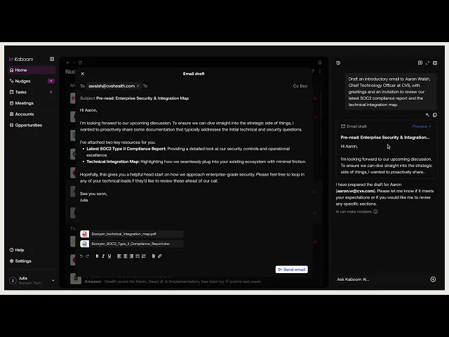
Across the experience, users can engage with the AI assistant to retrieve information, make updates, and execute tasks without breaking their workflow.
The redesigned experience is more focused and structured around a core concept.
Kaboom’s primary interaction model is now “Nudges.” These are AI-generated alerts that surface prioritized insights for the user’s day-to-day work. Each nudge includes recommended next steps that users can act on directly.
This creates a tighter loop between insight and action.
Across the experience, users can engage with the AI assistant to retrieve information, make updates, and execute tasks without breaking their workflow.
Core experience flow prototype.
Core experience flow prototype.
To encourage adoption of the AI assistant, I introduced a distinct visual treatment in empty states, using subtle animation to draw attention without overwhelming the interface.
I explored requiring users to select a specific account before issuing commands, but testing showed this created friction. Users often forgot to switch context, which led to errors.
I also explored prompt suggestions to guide usage. While this tested well conceptually, it was deferred due to scope and is planned for future iterations.

AI assistant iterations.
AI assistant iterations.
For viewing nudge details and similar interactions, I focused on enabling quick entry and exit without disrupting context.
We explored multiple patterns, including modals and drawers, while considering how they would coexist with the AI assistant.
Although I initially leaned away from overlays, testing showed they were the most intuitive and least disruptive option. We moved forward with that approach.

Drawer explorations.
Drawer explorations.
Another important addition was responsive design. Kaboom’s existing mobile experience was a basic engineering adaptation.
While mobile usage was relatively low, users still expected reliable access across devices. I advocated for including responsive design in scope and secured limited resources to deliver a more usable experience.

Mobile screen examples.
Mobile screen examples.
Outcome
Outcome
The redesign led to strong positive feedback and measurable improvements post-launch. Kaboom also secured two new clients, both of whom cited the updated experience as a key factor in their decision.
The redesign led to strong positive feedback and measurable improvements post-launch. Kaboom also secured two new clients, both of whom cited the updated experience as a key factor in their decision.
61%
61%
Decrease in
abandonment
Decrease in abandonment
88%
88%
Core task
completion rate
Core task completion rate
37%
37%
Increase in product
usage frequency
Increase in product usage frequency
Next Steps
Next Steps